Overview
A brand built on borrowed visuals
Overground's existing visuals were borrowed from elsewhere online, which left the brand feeling generic and disconnected from its own philosophy. The identity needed to feel as authentic and intentional as the music the label was releasing.
Goals & Scope
One identity, from digital campaigns to vinyl
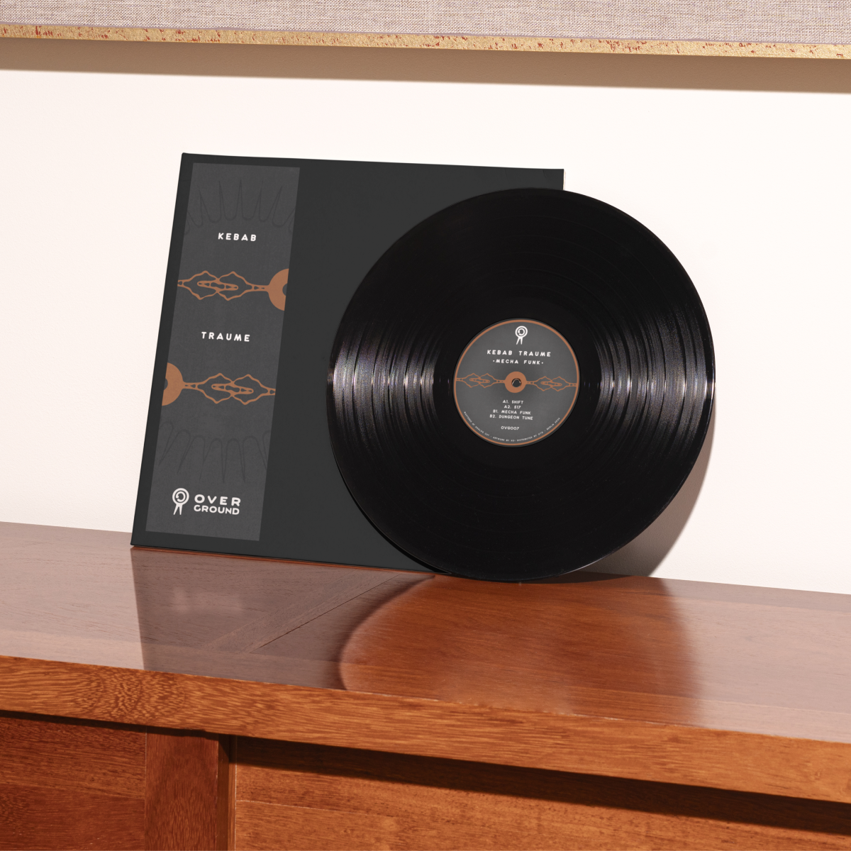
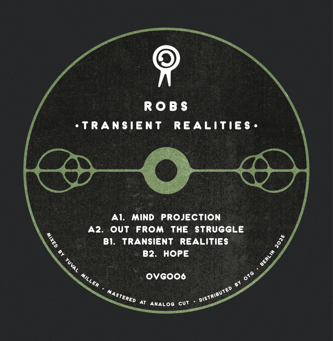
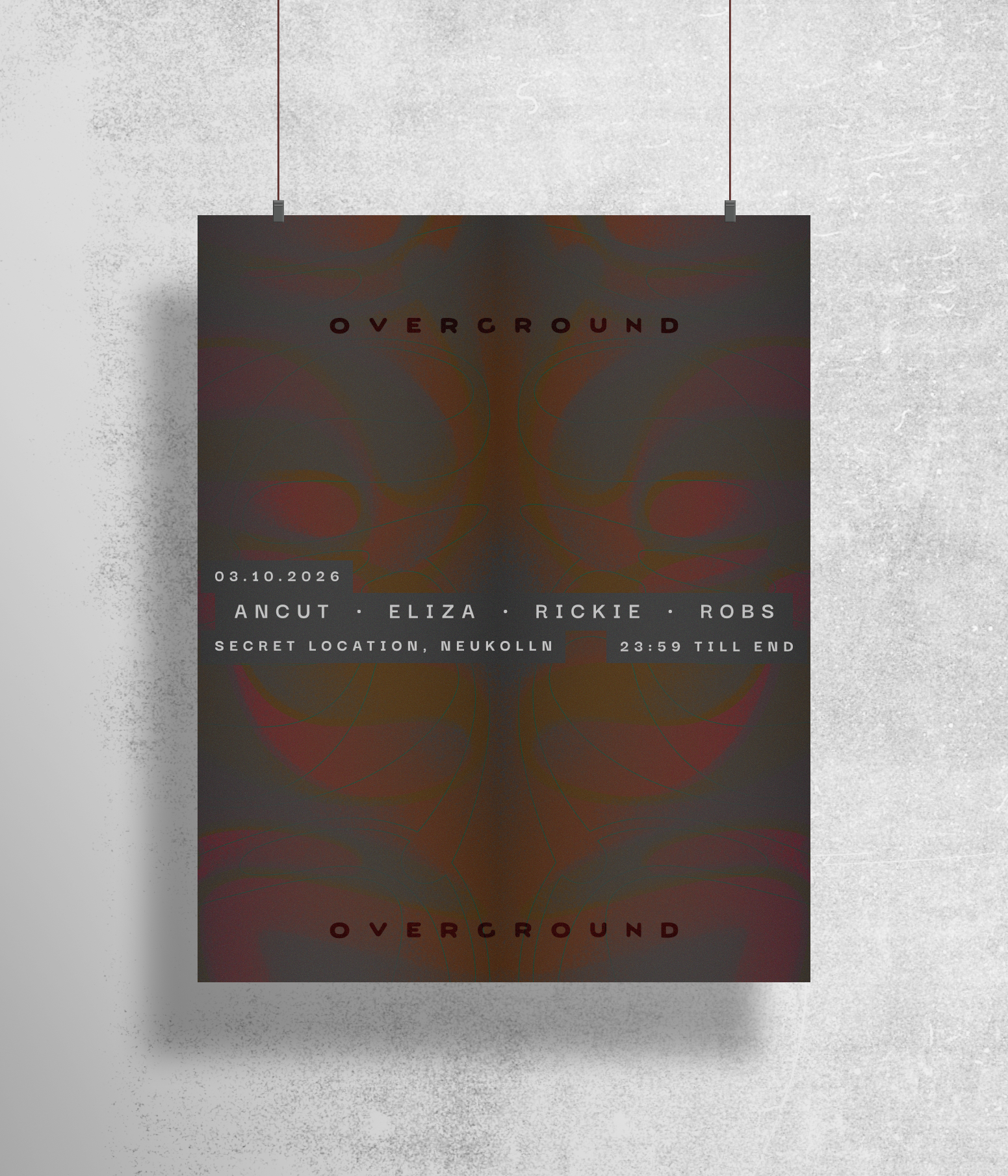
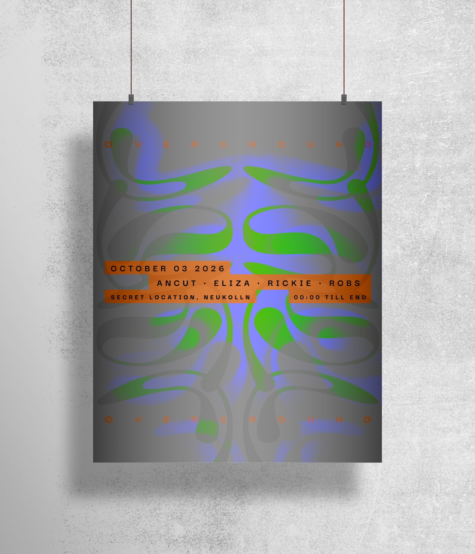
I defined Overground's visual identity system — typography, colour palette, and illustration style — built to move consistently across digital platforms, social media, and print. I then applied it directly to the label's releases, developing the full visual identity for two vinyl records the label pressed, including cover art, typography system, and iconography, alongside promotional posters and campaign graphics for events.