Usability test
User Testing showed consistent patterns
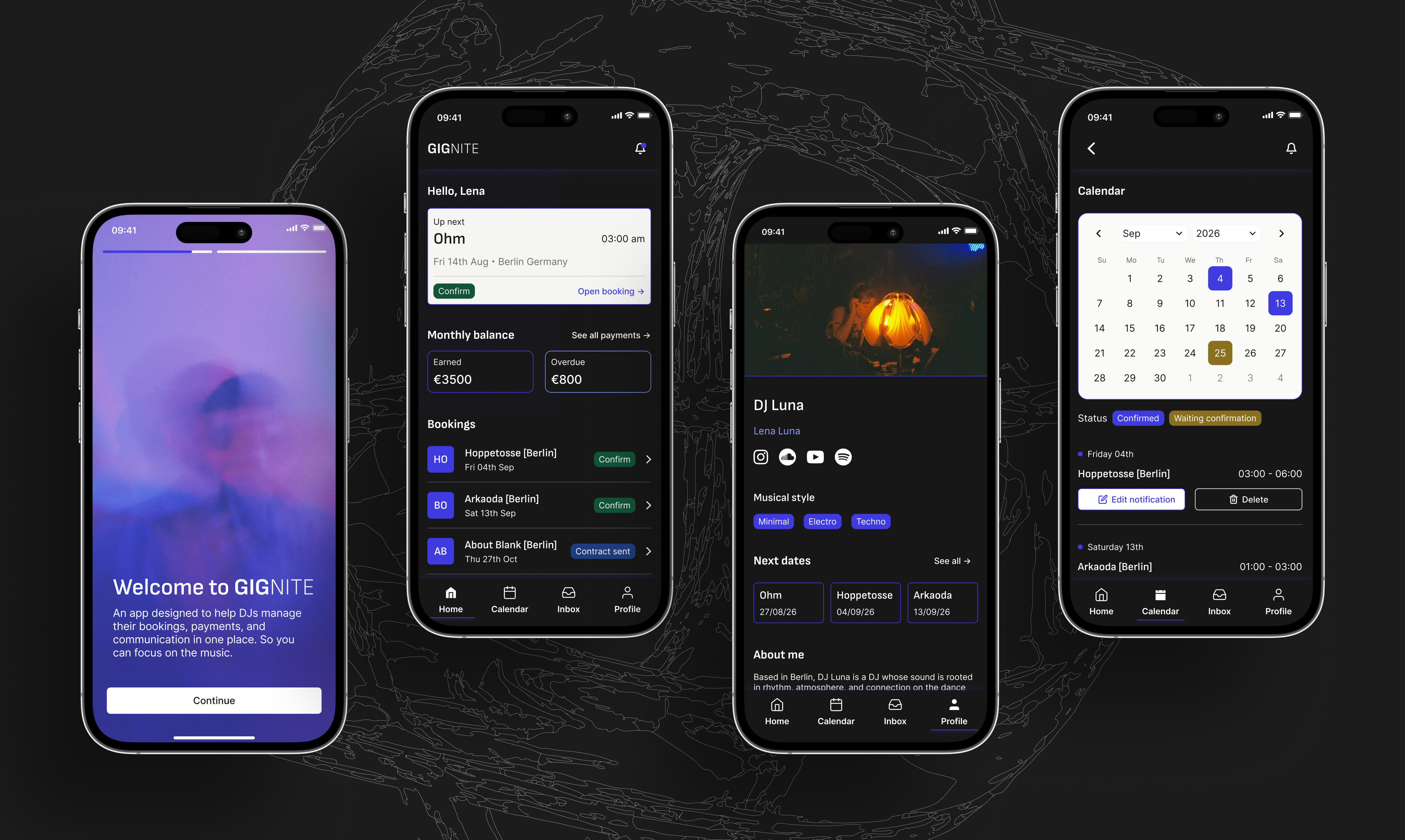
After building the prototype, I ran three rounds of usability testing, and three consistent patterns surfaced. In onboarding: users couldn't quickly understand what the app was about or who it was for from the welcome screens alone, so I changed how the app introduced itself and reduced the screens from three to two.
In payments: 'pending' was being read as already paid but not yet transferred, creating confusion with 'overdue', so I renamed and clarified the labels.
And in documents: the tech rider and press kit placement felt wrong to users, so I moved the press kit to the profile where it actually belongs.
Conclusions
What would I do next
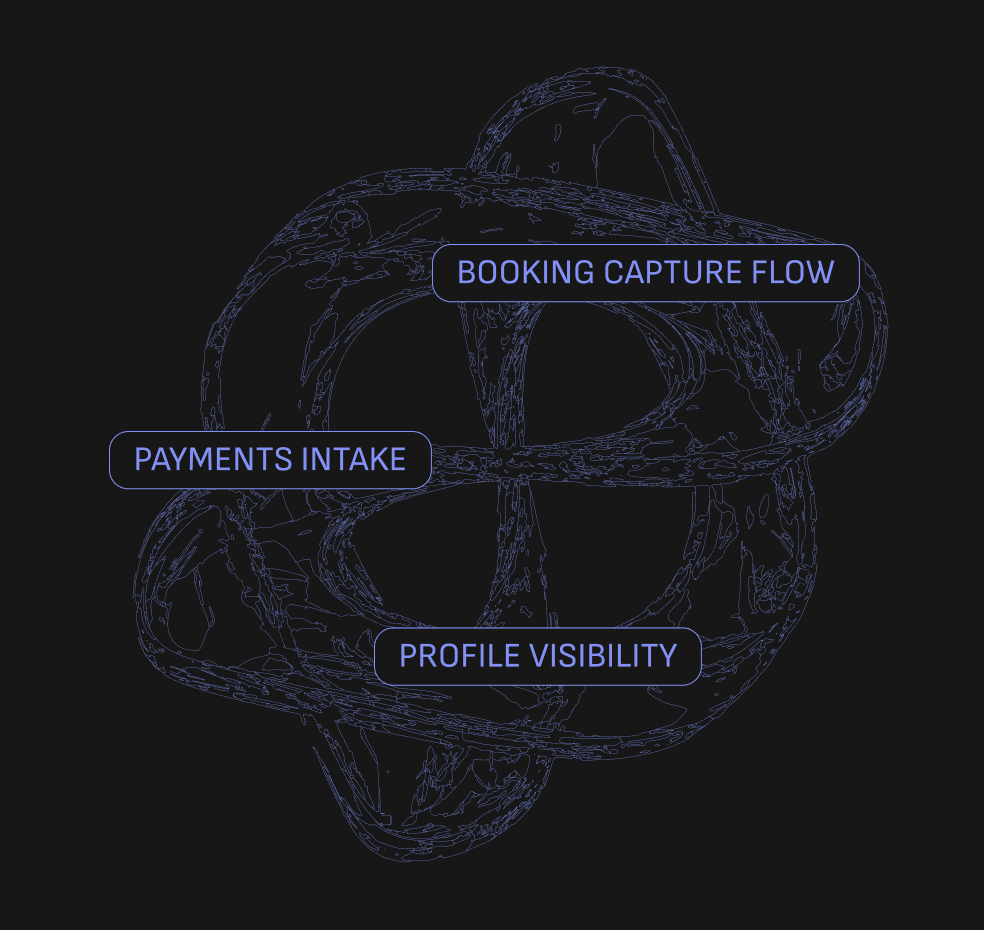
If I were to continue, three areas stand out.
• The booking capture flow: how a DJ logs a new inquiry is still the most open question in the product.
• Payment intake: how money actually moves through the app end to end.
• And profile visibility: testing showed the profile needs a clearer hierarchy and a new user flow for bookers discovering a DJ.